See it, don’t guess
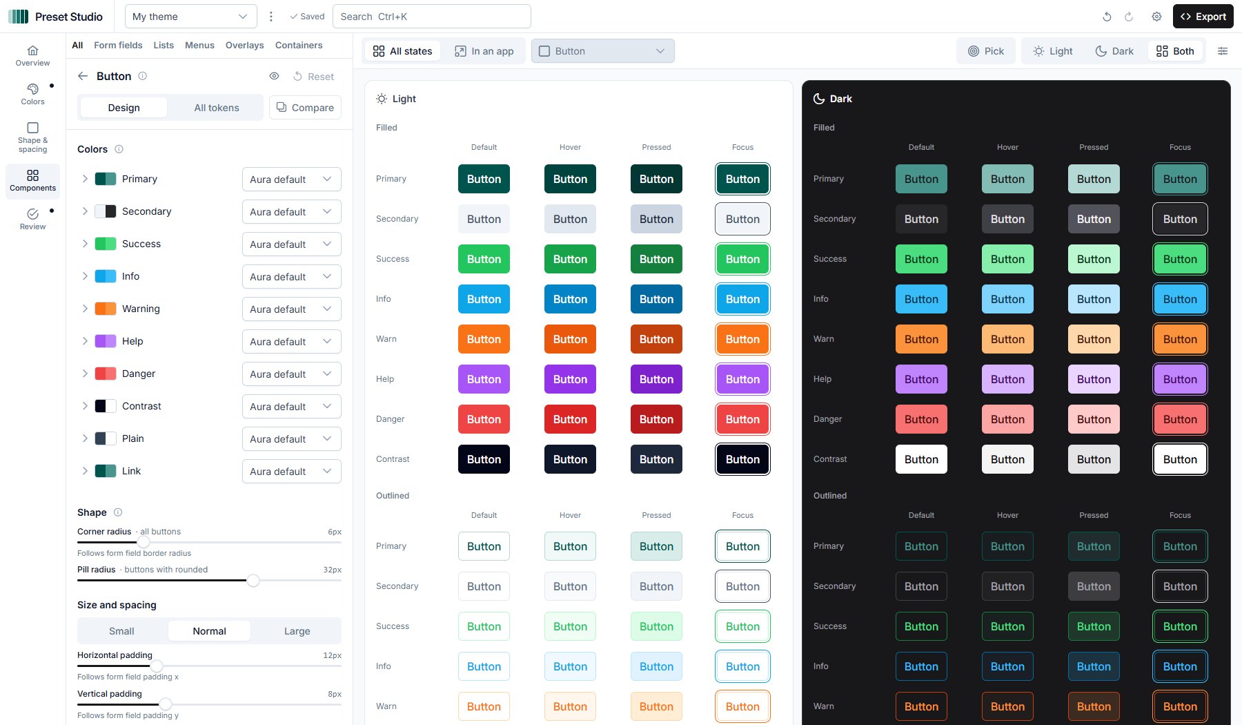
Every state, no hovering
Default, hover, pressed and focus side by side, for every variant.
Light and dark together
Every color is set for both modes. Change it once, see both.
Click to edit
Click a button, a tag or a field in the preview to open its settings.
What you can count on
Correct by construction
Every token is checked against PrimeVue’s own engine. The export holds only what you changed:
- Primary colorCustom #0f766e
Readable in light and dark
Checked in both modes, with a one-click fix. Try a pale yellow at the top.
| Pair | Light | Dark |
|---|---|---|
| Primary button text | 5.5:1 | 5.0:1 |
| Body text | 10.4:1 | 17.7:1 |
| Muted text | 4.8:1 | 6.9:1 |
| Selected item | 8.2:1 | 11.2:1 |
| Primary on surface | 5.5:1 | 5.0:1 |
Yours, and private
- Open source under the MIT license
- Your themes stay in your browser
- Themes travel as a link or a file
- A plain definePreset file, nothing extra to install
One color, all the way down
Your color replaces the palette and every reference stays, so it lands where Aura wants it.
- Paletteprimary.500Semanticprimary.colorComponentbutton.primary.backgroundOn screen
- Paletteprimary.500Semanticprimary.colorComponenttoggleswitch.checkedBackgroundOn screen
- Paletteprimary.100SemanticUses the shade directlyComponenttag.primary.backgroundOn screenNew
- Paletteprimary.500Semanticprimary.colorformField.focusBorderColorComponentinputtext.focusBorderColorOn screen
Four themes to start from
Open one to keep going from there.
What you take home
One definePreset file with only what you changed, and the setup for Nuxt or Vue. Or send the theme to a teammate as a link.
import { definePreset } from '@primeuix/themes'
import Aura from '@primeuix/themes/aura'

const MyPreset = definePreset(Aura, {
  semantic: {
    primary: {
      50: '#f0f9f8',
      100: '#d8ece9',
      200: '#b4d8d3',
      300: '#83bcb5',
      400: '#48958d',
      500: '#0f766e',
      600: '#00655e',
      700: '#00544e',
      800: '#00443f',
      900: '#043632',
      950: '#04221f'
    }
  }
})

export default MyPreset
Questions
Your choices come with you into the editor.